AcePlan Tennis Web App, Branding & Marketing Website
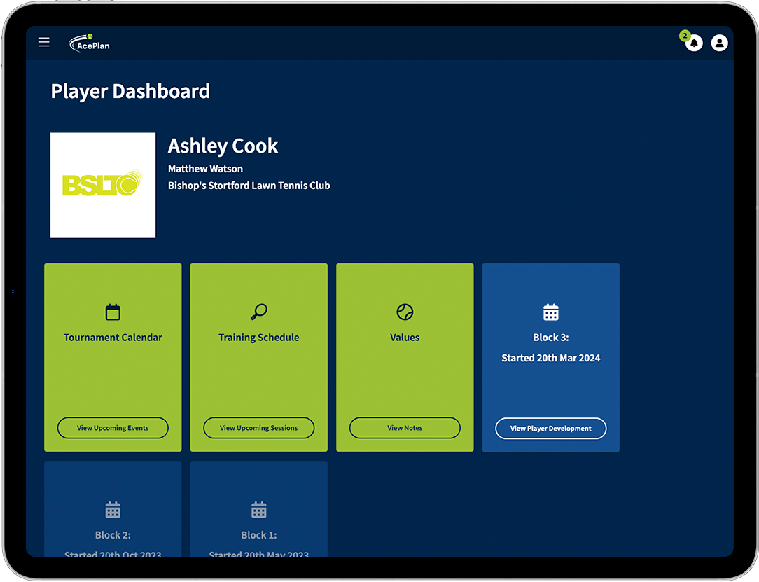
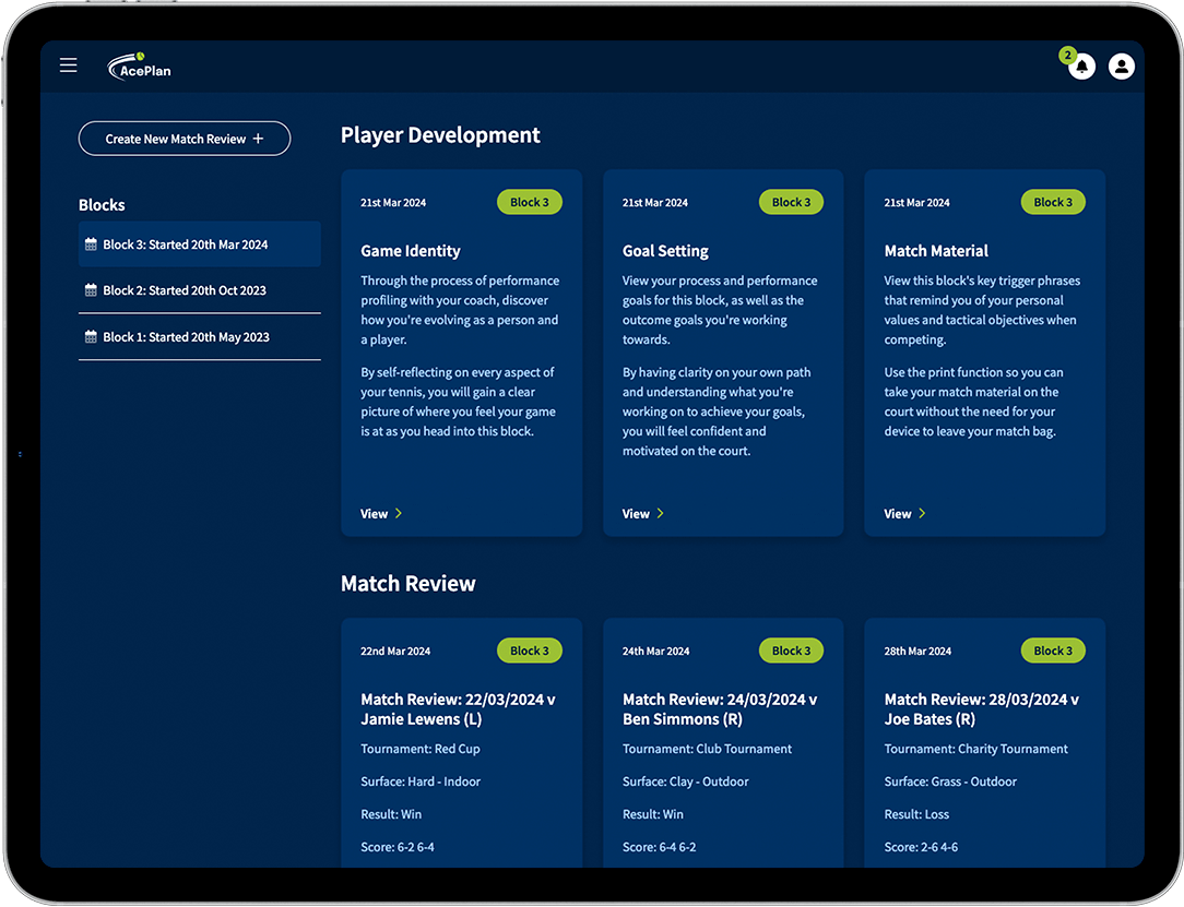
AcePlan is software designed specifically to support tennis players with their off-court development so they can track their progress and maximise their potential. It can also be used by tennis coaches to organise all their players’ development plans.
I worked with the account manager and the client to understand the requirements for the software, in which I then created designs using Adobe XD and built mockups using HTML and CSS (Bootstrap). These were then passed over to the development team.


To create the AcePlan branding, I worked with the client to bring their ideas to life. They wanted the logo to look like the tennis ball was moving around the text in some way. After various iterations, I eventually formulated the final logo in which I created different lines with various lengths and widths to represent the movement of the tennis ball that partially wraps around the text, and a hint of green for the tennis ball. I chose a bright green and navy colour palette because the navy allows the green to really ‘pop’ to give a fresher and livelier feel.

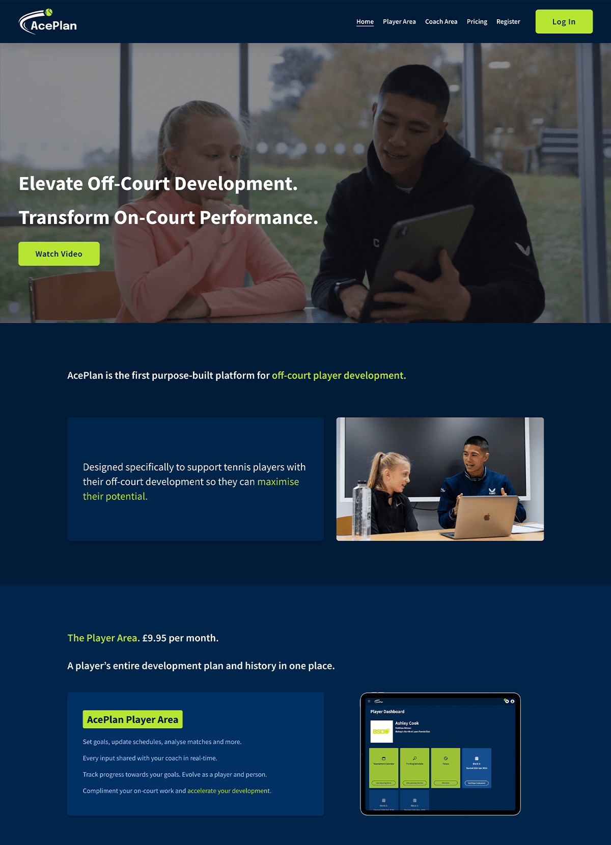
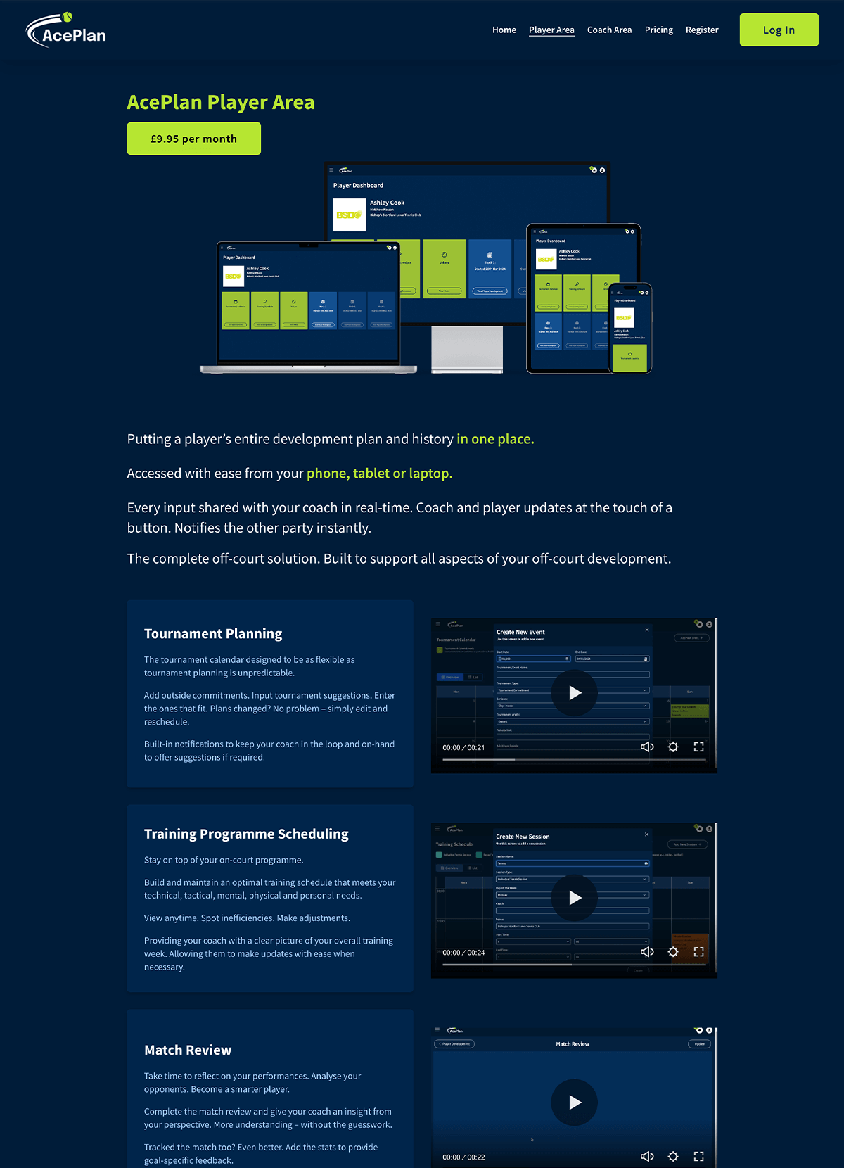
As well as designing the AcePlan software, I also created a marketing website using Squarespace. As inspiration for the look and feel of both the software and marketing website, the client provided some example websites that they liked. The dark colour scheme was something that they particularly wanted alongside highlights of green and plenty of images to showcase the software.
Website: www.aceplantennis.com

